
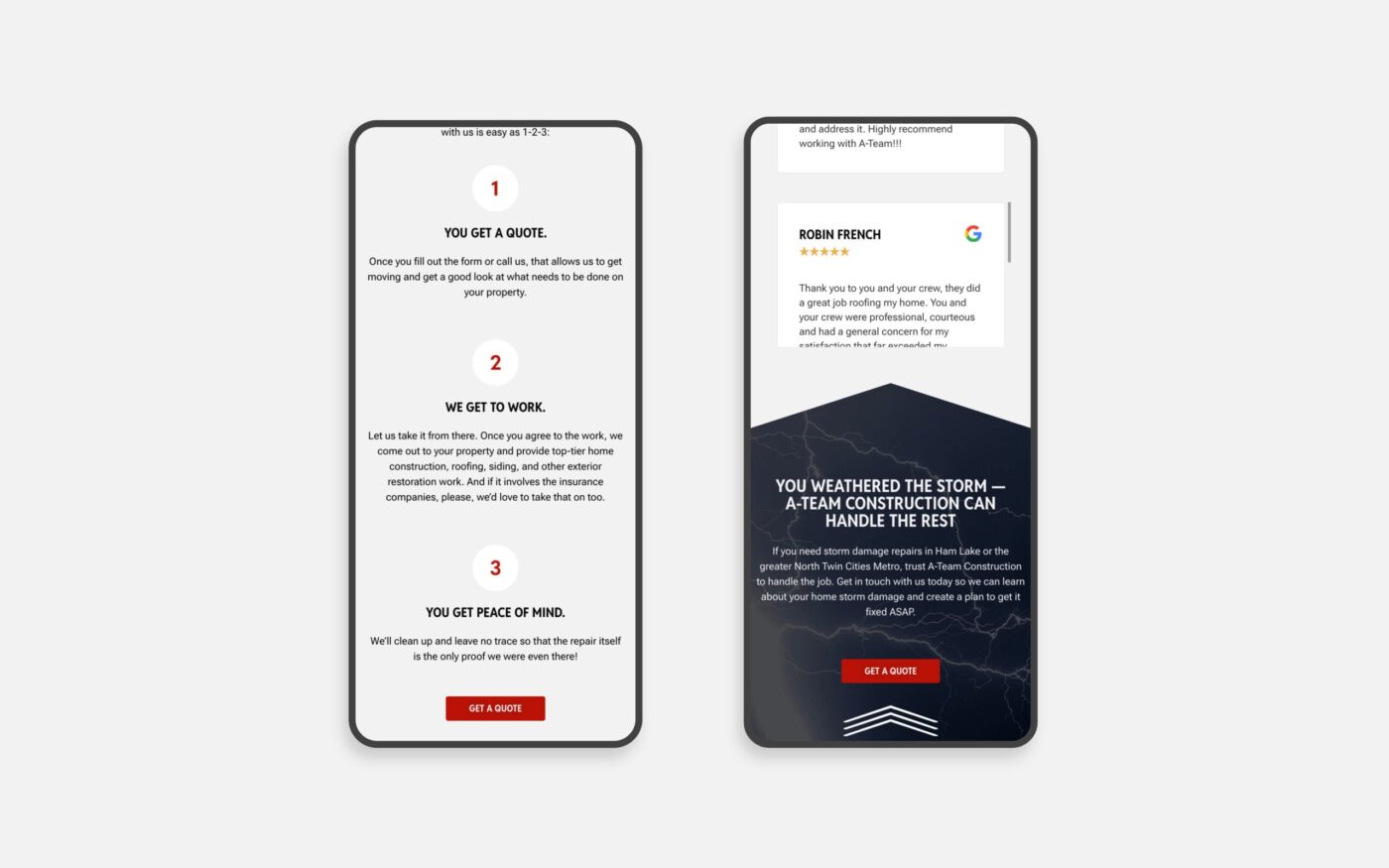
Your website may be designed on a desktop, reviewed on a desktop, and approved on a desktop. But there’s a good chance a significant portion of your customers will experience it for the first time on a phone.
And they aren’t grading the mobile design. They’re trying to do something.
They want to understand what you do. Find a service. Look at your work. Check your location. Read reviews. Get a phone number. Fill out a form. Decide whether your business feels credible enough to contact
If the mobile experience makes any of those things unnecessarily difficult, the website is creating friction at exactly the point you’re asking someone to take an interest in your business.
Good mobile design isn’t simply making sure your desktop website technically works on a smaller screen. It requires thinking about how someone actually uses your website when the screen, context, and behavior are different.
1. Treating Mobile Like a Smaller Desktop
One of the most common mistakes we see is a website that has technically been made “responsive,” but hasn’t really been designed for mobile.
Everything from the desktop version is still there. It’s just stacked vertically.
The result can be oversized sections, unnecessary content, awkward image placement, long stretches of scrolling, or information appearing in an order that no longer makes sense.
Mobile requires prioritization.
What does someone need to understand first? What information can wait? Which visual elements still add value on a smaller screen? What should be shortened, moved, or removed entirely?
The mobile version doesn’t need to contain less value. It may need to deliver that value differently.
2. Making Navigation Too Complicated
A large desktop menu can work beautifully when someone has plenty of screen space. Put that same information behind a hamburger menu on a phone and suddenly the visitor is opening dropdowns inside dropdowns trying to find one page.
Mobile navigation should help people make decisions quickly.
Prioritize the pages customers are most likely to need. Make the menu easy to scan. Give links enough space to tap comfortably. And don’t bury the primary action you want someone to take.
If contacting you is one of the most important actions on the website, someone shouldn’t have to work to find out how.
3. Using Buttons Designed for a Mouse
This seems small until you’re the person trying to tap a tiny link with your thumb.
Buttons that sit too close together, text links with very small tap areas, vague labels, or calls to action that disappear into the design can make a polished website surprisingly frustrating to use.
On mobile, your primary actions should be obvious and easy to select.
A few things worth checking:
- Can you comfortably tap every button without accidentally hitting something else?
- Does the button tell you what will happen next?
- Is there enough contrast to recognize what’s clickable?
- Can someone easily call, inquire, schedule, purchase, or take the next logical step?
A visitor shouldn’t have to be precise to use your website.
4. Creating Pages That Feel Endless
Long pages aren’t automatically a problem on mobile. Poorly structured long pages are.
When every section has the same amount of spacing, similar text lengths, large images, and no clear hierarchy, the visitor can lose any sense of where they are or what’s important.
Vary the experience.
Use headings to make the page scannable. Break longer information into meaningful sections. Give important ideas room. Reduce content that doesn’t need to be there. Make sure the next important piece of information doesn’t require scrolling through three screens of visual filler to reach it.
Whitespace matters too, but adding more space everywhere isn’t necessarily the answer. Good spacing helps people understand which things belong together and where one idea ends and another begins.
5. Letting Images and Video Slow Everything Down
A beautiful website that takes too long to load isn’t providing a beautiful experience.
Large photography, background video, animation, and other visual elements can add a lot to a brand, but they need to be implemented with performance in mind, especially on mobile connections.
Images should be properly sized and compressed. Modern image formats can reduce file sizes significantly. Video should be optimized and, when appropriate, hosted externally rather than forcing the website to carry unnecessarily large files.
Be especially thoughtful about what loads immediately at the top of the page. A visitor shouldn’t have to wait for a large video before they can understand the business or interact with the site.
Visual impact and performance aren’t competing priorities. A well-built website should account for both.
6. Only Testing the Mobile Preview
Website builders and browser preview tools are useful. They are not a replacement for putting the website in your hand.
Open it on an actual phone.
Then stop looking at it like the person who built it.
Try to find your most important service. Use the menu. Click the phone number. Complete the contact form. Read a longer page. Rotate the phone. Test it on more than one screen size and, when possible, on both iPhone and Android devices.
Better yet, give it to someone who isn’t familiar with the website and ask them to complete a few basic tasks without telling them where to go.
Watch where they hesitate.
Those moments can tell you much more than simply confirming that the site “looks good on mobile.”
Your Mobile Website Is Part of the Customer Experience
A mobile website doesn’t need to impress someone with how well it was designed for a phone. It needs to make interacting with your business feel easy.
That’s an important distinction.
The visitor should be thinking about your company, your work, and whether you’re the right choice for them. They shouldn’t be thinking about how to close a menu, where the contact button went, why the page hasn’t loaded, or whether they tapped the wrong thing.
Pull out your phone and go through your own website today as if you had never seen it before. Pick the three things a prospective customer is most likely to come there to do and try each one.
If any of them require more effort than they should, that’s where I’d start.
If your website no longer represents the quality of the business behind it, or you’re unsure where the experience is creating friction, start a conversation with Re3. We can help you determine what actually needs attention before deciding what needs to change.
