A call to action is one of the simplest parts of your website, but it’s also one of the easiest to overlook. Many businesses focus on design, messaging, or visuals—yet skip the direct guidance visitors actually need. A strong CTA isn’t just a button. It’s clarity. It’s leadership. It’s a signal that tells someone, “Here’s the next step.”
When CTAs are clear and intentional, visitors move confidently. When they’re vague or missing, people hesitate, get lost, or exit the page entirely. Here’s what makes a CTA effective and how you can strengthen the ones on your website.
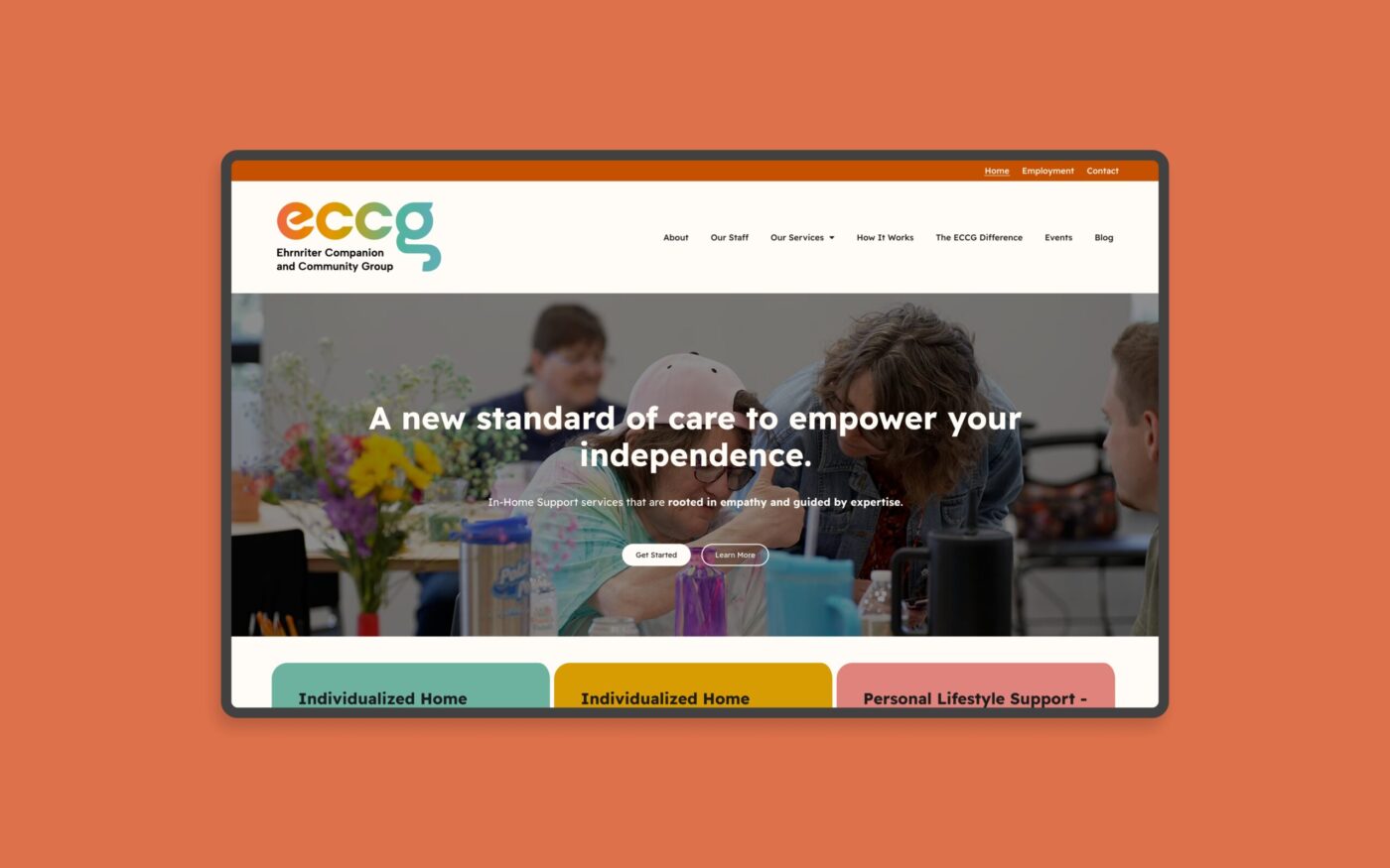
Clear, Simple Design
Design helps direct attention. A good CTA should be noticeable without overwhelming the page. Strong color contrast, proper spacing, and a button size that works on both desktop and mobile make it easy for someone to act. When a CTA blends into the design or gets lost in a busy layout, people skip right past it. Visual clarity builds trust.
Direct, Helpful Copy
The best CTA copy is simple and actionable. Visitors should immediately understand what will happen when they click. Phrases like “Schedule a Call,” “Start Here,” or “See How It Works” give direction without pressure. When copy is vague or overly clever, people pause—and that pause often leads to a bounce.
Logical Placement Throughout the Page
Strong CTAs appear where someone naturally needs guidance. At the top of a homepage, after a description of your services, at the end of a case study, or inside a pricing section—these are moments where people are already evaluating what to do next. Placement shapes the customer journey. A well-placed CTA removes friction and helps move them forward.
Consistency Creates Confidence
When every page uses different language or competing goals, the experience feels scattered. Clear, consistent CTAs signal a unified brand and a guided journey. They help visitors trust that they’re heading in the right direction.
A CTA Should Feel Like Your Brand
A strong CTA doesn’t need to be flashy. It just needs to reflect your tone and the experience you want people to have. Clean design, simple language, and a confident next step are often all you need.
Clear CTAs improve user experience, strengthen conversion paths, and quietly reinforce your credibility. If you want clarity on your website structure, messaging, or CTAs, you can start here:
https://re3creative.com/our-method